Showing posts with label editing. Show all posts

Thursday, April 24, 2025

House of Death (aka Death Screams) Badly Butchered in "Restored" Streaming Versions

House of Death (1982, aka Death Screams) is an obscure slasher films from the 1980s, and thus many people might not notice if a distributor butchers it. But I own eight different copies of the film: a Beta cassette, a DVD, and six MP4 files.

That House of Death has never enjoyed a digital restoration released on blu-ray is not entirely logical, because many horror films that are both worse and more obscure have been released on blu-ray.

I was initially pleased to see the film's version on Tubi, because its visual quality is improved in some ways. Colors are more vibrant, and images are sharper than most (but not all) versions found YouTube, which seem to be transfers from old video cassettes (VHS, I assume). In terms of color and resolution, the Tubi version is superior even to my DVD version (which also seems taken from an old video cassette).

But the problems with the Tubi version are twofold. (I call it the Tubi version, but I've found an identical version on YouTube, so I doubt that Tubi is responsible for the film's "restoration".)

First, the Tubi version employs what I call "double cropping." This is when a distributor takes a widescreen film whose sides have been cropped to create a full screen (for old TV sets), then crops this full screen's top and bottom to create a new widescreen.

Thus, a widescreen film has been cropped twice, leaving little of the original image. Enough to be watchable, but the director's original compositions are gone. Wide shots become medium shots, medium shots become closeups, closeups become extreme closeups.

Observe the two below images from House of Death. The top image is a video cassette's full screen image (the original widescreen already cropped at the sides.) The second image (taken from Tubi) has cropped the image for a second time, this time its top and bottom, to create a new widescreen. The film's original widescreen has now been cropped on all four sides.


You'll notice the Tubi version's improved colors and resolution. I assume the restoration was done on a version found on an old video cassette. The original widescreen version (probably 35mm film stock) is probably lost.

But that's no excuse for the double cropping. If only a full screen version remains, let's watch House of Death in full screen. Cropping additional material to create a new widescreen only makes things worse.

I suppose distributors think the public wants widescreen and won't realize they're watching a badly butchered version rather than the original image.

But Tubi's version of House of Death has additional problems. It's missing two key sequences.

IMDB lists House of Death with a running time of 1.28 (an hour and 28 minutes). Tubi's version runs at 1.28.06. My MP4 versions range from 1.25.30 to 1.31.33. Clearly, House of Death has suffered many distributors and re-edits.

Here are the sequences missing in Tubi's version, which appear on my Beta tape and the 1.31.33 MP4 version on YouTube:

1. The scene wherein Romana sneaks into the coach's house is longer (and includes a topless shot of actress Jennifer Chase). That this scene is excised from the 1.28 versions is obvious from the crudely abrupt cut from the bathroom to the bedroom, the characters' whole demeanors having changed. Something had obviously occurred between them, but what? In the longer version, we see that the coach rebuffed Romona's advances, and tossed her into the shower to "cool off."

2. In the penultimate scene, when the coach attacks Lily with a machete, there is a brief flashback that depicts the coach as a young boy in the bordello in which his mother worked. This flashback explains why he hates and kills "slutty" women (and their men). This flashback is missing entirely from the shorter 1.28 versions.

In the final scene (in both long and short versions) Sandy asks "Why?" She and everyone else is baffled as to why the coach went on a murder spree. Viewers of the shorter version are equally baffled. But those of us lucky to have seen the longer version, know the answer.

==================

For more information on composition and editing in horror films, see Horror Film Aesthetics: Creating the Visual Language of Fear. This blog represents a continuing discussion of my views on horror, picking up from where the book left off.

Monday, January 6, 2025

Beneath: A Cave Horror and Its Brief Glimpses in the Dark

Beneath: A Cave Horror (2018) accomplishes much with little. Its story is unoriginal and its cast is unpolished, yet the film has a creepy atmosphere and genuine scares.

The story consists of five young tour guides who work for a local cave attraction. The cave is infamous as the site where a cult conducted a human sacrifice to conjure a demon -- the Midnight Man -- back in 1966. And so, on Halloween night of "The Present Day" (as the screen credits inform us), the tour guides conceive the bright idea of holding a party in the cave along with a ceremony to conjure the Midnight Man.

No, they don't intend a human sacrifice. Just a little blood drawn from each guide's finger. Perhaps a human sacrifice is unnecessary because the Midnight Man presumably already lives in the cave, but, as the internet informs them, he slumbers after every ten years if he's not called. So this is a lesser ceremony meant to wake him. (Okay, the rationales are kinda murky.)

Beneath runs at about 78 minutes (not including end credits), and our heroes enter the cave a half hour into the film. So most of this low budget affair is set in the cave.

The cave provides a dark, creepy, claustrophobic atmosphere. Some areas are well lit, but I suppose a tourist attraction would have a light setup. At some point, the guides wander off the designated tour path, and it gets darker.

Like many low-budget horror films, Beneath demonstrates that nature does not discriminate against the poor. A cave (or forest, or desert, or beach) looks equally impressive whatever the budget.

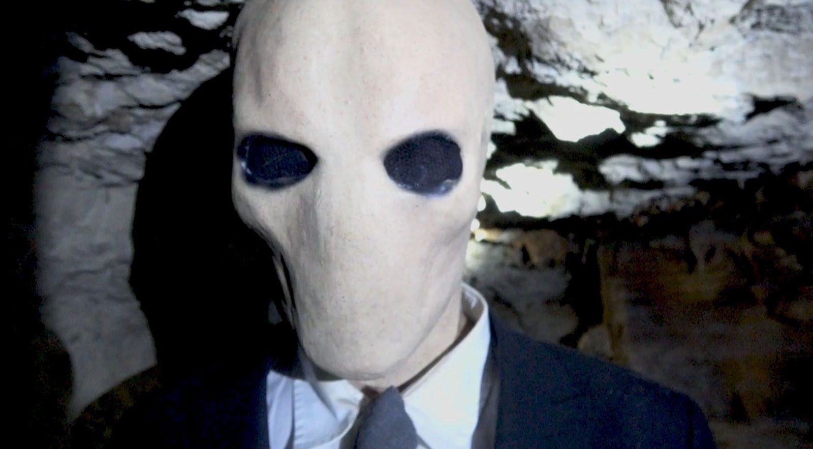
But I especially admire Beneath's handling of the demonic Midnight Man. I'm not a big fan of Full Moon's rubber suit demons. By contrast, the Midnight Man is just a man in a black suit wearing a gray alien mask (well, a beige alien). The face is original and unexpected (not your usual demon) and thus startling at first glance.

Filmmaker J.J. Perez doesn't spend much screen time showing us his demon. Only brief glimpses in the dark, usually in wide or medium shots. This is wise because lingering on the face, especially in close-up, would lessen the tension. The face would more obviously appear as a silly mask.

If you have an obvious mask, or crude make-up, best limit its appearance to brief glimpses. Plus there's the theory that if an audience doesn't clearly see something, their imaginations will fill in the unseen details with the worst assumptions.

This technique of showing only brief glimpses of the horrific can also be seen in Tower of Evil (British, 1972) the "Mannikins of Horror" (sic) episode of Monsters (1989), and The Crane Wife (2024).

Perez uses another old trick to good effect, one that combines lighting and editing:

Sarah (Meghan Forbes) is alone in the cave when her flashlight runs out of power. So she uses her camera's flash as a light, repeatedly taking photos, seeing what's up ahead with each flash. For the first two flashes, she sees nothing. The next four flashes shows the Midnight Man approaching. Sarah grows ever more panicked. (Why doesn't she run?) But the next two flashes shows no demon.

Is Sarah safe?

Horror fans know that, though the demon appears to have left, the next time Sarah flashes her camera, the demon will be right in front of her. And sure enough, that's what happens.


It's an old trick, but it works. It's one of the most effective scares in Beneath.

Beneath: A Cave Horror, has a low score on IMDB. Yes, the film is rough in spots. The cast's delivery of the unoriginal dialog is stilted at times. Even so, Perez displays talent. I enjoy Beneath for what it is: well made trash horror with much entertainment value.

=========================

For more information on lighting or editing in horror films, see Horror Film Aesthetics: Creating the Visual Language of Fear. This blog represents a continuing discussion of my views on horror, picking up from where the book left off.


Monday, March 1, 2021

Stagefright Uses Editing to Disorient and Unnerve

The editing in Michael Soavi's Stagefright (1987) effectively disorients the audience, thus unnerving them and making them more susceptible to shocks and fear.


A mad slasher (wearing an owl mask) is stalking six people trapped in a theater. Alicia (Barbara Cupisti) runs into the shower room, where she finds Laurel (Mary Sellers) lying in the left stall, bloodied but still alive. Alicia hears the slasher approaching from the hallway.


Cut to the slasher in the hallway.


Cut to Alicia, having heard the slasher, closing back the curtain on Laurel in the left stall, then hiding in right stall.


Cut to Alicia in the right stall, pulling the curtain closed.


Cut to the slasher entering the shower room. Two curtained stalls before him. Laurel on left (behind the bloodied curtain). Alicia on the right.


Cut to Alicia in the stall.


Cut to the slasher's POV (point of view), coming toward the two shower stalls.


Cut to the slasher's silhouette across the curtain. He is drawing near.


Cut to Alicia's worried expression. Her eye line is directed at the curtain. Her acting and the eye line match implies that the silhouette is her POV. That the slasher is approaching her stall.


Cut to Alicia backing against the wall. Her staging reinforces the notion that the silhouette is against her curtain.


Cut to slasher drawing nearer to the curtain. Close enough that his owl mask is visible. Then in the same shot, he yanks aside the curtain.


Cut to a close up on Alicia. Her eye line is directed toward the slasher in the previous shot. She appears to be looking at him.


Cut to the slasher drawing nearer. The mask's eye line directed at Alicia in the previous shot.


Cut to Alicia's POV of the slasher looming over Laurel. In the same shot, he raises Laurel, who looks toward Alicia in the right stall.


Cut to Alicia looking back at Laural, eye line match to Laurel.

Thus Stagefright's editing has fooled us. The POV shots, eye line matches, acting, staging, and editing suggested that the slasher was approaching Alicia's stall. But it was Laurel's. He still doesn't know that Alicia is there. She is still safe.

For more examples of how editing can disorient an audience, see my posts on Vacancy and Galaxy of Terror.

===============

For more information on editing in horror films, see Horror Film Aesthetics: Creating the Visual Language of Fear. This blog represents a continuing discussion of my views on horror, picking up from where the book left off.

Tuesday, September 23, 2014

The First Step: Obscuring Low-Budget Makeup Effects

Sometimes less is more. A threat might be more frightening if unseen and left to our imagination. For instance, the entity in The Haunting, slowing pressing in the heavy wooden door as the terrified characters watch from its other side. We never did learn what lurked behind that door.
But sometimes "less is more" is just a filmmaker's excuse to show less (fewer sets, locations, actors, or special effects) because he could not afford to show more. The film needed to show more (nothing was aesthetically gained by its showing less), but more was not in the budget.
And sometimes these two motivations for showing less -- aesthetic and financial -- conjoin in a mutually supportive manner.
In The First Step, a cellar dweller creeps up from a basement, up three flights of stairs, to kill a little girl. This is a short, low-budget ($500) film. As such, the cellar dweller's makeup effect (by Delia De Cock) is admirably original and effective, but upon close examination, it looks like makeup.
This means that, should audiences get an opportunity to closely examine the makeup, it will be that much harder for them to suspend their disbelief and enjoy the horror.


The First Step solves this problem by obscuring the cellar dweller with dim lighting (such that the creature is often seen in silhouettes) ...


... and a soft focus (thus blurring the edges of the makeup application, so that the creature's twisted features appear natural).  


Framing also helps obscure the monster, often showing us only its body parts (e.g., a foot, a clawed hand, etc.).
I don't know if this was the filmmakers' (Daniel Brown and Kate McMeans) intent behind their lighting, photography, and framing, but that's the aesthetic effect. If you were to pause the film and scrutinize the creature, then its feature will more clearly be seen as artificial makeup, rather than actual monster skin. But when seen only briefly in quick cuts, and under dim lighting, and through a slight blur, then the creature's artificiality is less obvious.
By obscuring the cellar dweller, more is left to the viewer's imagination. This imagination is further stimulated by the monster's creepy voice and disjointed body movements, (actress Jon Anna Van Thuyne), both of which suggest all manner of horrors.


To recap:
The First Step's low-budget yields some fairly nice monster makeup effects, but these effects are obviously artificial should viewers closely examine them. To prevent such close examination of the makeup, the filmmaker employs...
* Dim lighting (creating silhouettes),
* Soft focus (blurring the image),
* Tight framing (showing only parts of the monster),
* Quick cuts (further preventing close examination of the creature).
This leaves the creature's nature up to our dark imaginings, which are further stimulated by ...
* Sound (a creepy voice for the monster),
* Acting (disjointed body movements by the actor).

=======================

For more information about lighting, photography, framing, editing, sound, and acting in horror films -- see Horror Film Aesthetics: Creating the Visual Language of Fear. This blog represents a continuing discussion of my views on horror, picking up from where the book left off.

Sunday, July 6, 2014

Poor Staging of Actors in Evidence of a Haunting

One of the film director's jobs is to stage the actors -- to instruct them on where to sit or stand, where to look, when to notice each other, etc.

Staging is a fine art, the search for a delicate balance. It's rarely a good idea to over-direct the actors, directing their every smile, frown, head tilt, eyebrow lift, shift in tone of voice. Then the actors feel like constrained marionettes, denied the freedom to "find their character."

But neither is it a good idea to just dump the actors on set, and leave them milling about, without any instruction or direction. This is especially true if one is working with amateur actors, because they lack the training to behave appropriately without direction.

Evidence of a Haunting, yet another fictitious horror film about "true-life TV ghosthunters," provides an instructive example of inept staging.

In this scene, our team of ghosthunters go to their next investigation, a haunted suburban house. We see our ghosthunters outside the house, approaching the front door...


We then cut to this (above) shot of a father and his two daughters, standing like mannequins in the hallway, doing nothing very much. Apparently the director placed them in the hall, because soon the doorbell will ring, so they must be prepared to open the door.

HUH?

How does this family know the ghosthunters are soon to ring the bell? Were they standing in the hall for the past several hours, just waiting for the doorbell to ring?

I also love how the father has his eyes closed, the older daughter slouches while smirking and staring at nothing much, and the younger daughter looks bored.

Well, of course she's bored. You'd be bored too if you spent your evenings standing in a hallway waiting for someone who is expected to arrive sometime over the next several hours.

As for the older daughter, I suppose she's smirking because she's so excited to be in a movie. It's anyone's guess why the father fell asleep.


DING-DONG!

Now the doorbell rings, bringing the father and older daughter to life. The younger daughter is a little late to react.

Perhaps this shot is taking a long time to finish. Young children bore easily. Amateur child actors are no exception to this rule.


Even so, the younger daughter comes alive in time to lean in unison with her family, as everyone prepares to see who's out there. The family that leans together stays together.

Captions now also provide their names, identifying them as our ghosthunters' clients.


And our ghosthunters are outside! They enter and everyone exchanges the usual banal pleasantries.

This shot is poorly staged, poorly directed, and poorly edited.

* A better alternative is for the actors to have been staged off-camera, as if they were busy living their lives elsewhere in the house. They should have entered the hallway only after the doorbell rings.

* Even better if only one of them enters the hall to open the door. Otherwise it's a light bulb joke. How many clients do you need to open a door? Three. One to turn the knob and two to lean over and watch.

* Another alternative would have been to delete this shot entirely. Why not just cut to an exterior shot of the house, followed by our ghosthunters already interviewing the clients inside the house. It would have quickened the pace. As it is, this shot is not only poorly staged, it is superfluous, in that it doesn't add anything necessary to the film.

* At the very least the director should have trimmed this shot so that we don't see the family waiting in the hall, the father asleep. Perhaps the actor was only resting his eyes, or blinking. It's a brief moment. Even so, the director should have caught it in the editing room and trimmed the shot. The film's editor also bears blame.

Evidence of a Haunting has many problems. This shot is just a sample. The film is poorly written, ineptly staged, and performed by a cast of amateur wannabe-actors. But I can forgive bland dialog and amateurish acting if a film is entertaining. Evidence of a Haunting is not. It's boring.

For an example of good horror staging, see my post about "Legion of Demons."

=======================

For more information about staging and editing in horror films -- see Horror Film Aesthetics: Creating the Visual Language of Fear. This blog represents a continuing discussion of my views on horror, picking up from where the book left off.


Wednesday, April 16, 2014

The Kiss: Implied Gore in Offscreen Space

A long-running debate in horror film criticism is the merits of explicit vs. implied threats. Which packs the greater emotional punch? To see gore in all its graphic detail, or to leave such horrors to our imagination?

The Kiss (1988) provides an excellent example of the power of implied gore, in a scene that is set at a department store. The scene comprises 39 shots, running a total of 1 minute, 19 seconds. 

The scene opens with three closeup shots of escalator stairs, from different angles. 


Two teenage girls step onto the escalator, Amy (Meredith Salenger) and Heather (Sabrina Boudot). 


As they rise with the stairs, Heather realizes that she's dropped her lipstick. She returns to the bottom of the stairs to retrieve it. As she reaches for it, her necklace is caught by the escalators.


Naturally, Heather is unable either to extract the necklace from the stairs, or to remove the necklace from around her neck.

There follows an increasingly tense series of shots. Heather rising with the stairs. Amy looking on in horror, screaming for help, unable to help Heather.


Amy's boyfriend, Terry (Shawn Levy), who works at the store, hears Amy. He rushes to the escalator. He kicks the Emergency Stop button, but to no avail. The escalator won't stop. 


As the scene progresses editing heightens our sense of panic through brief, quick cuts of the same few shots -- Terry's frantic kicks, Amy's horrified gaze, the moving escalator stairs -- and Heather's screaming face, the necklace wrapped ever more tightly across it.


Viewers, morbidly tantalized, fearfully anticipate what will happen to Heather's face when she reaches the top of the escalator. But when Heather does arrive, the penultimate shot of is Amy's horrified gaze -- then a final shot of the escalator stairs, still running smoothly as blood, hair strands, and necklace bits collect at the top.


What happened to Heather is left to our imagination. Instead, we cut to a scene of a distraught Amy arriving home. We learn that Heather is in the hospital, "badly cut up."

We never see or hear of Heather again. Her face -- or what's left of it -- is forever left to our imagination.

This scene's dramatic setup and editing do much to build audience tension. So much so that our minds filled in the blanks as to what occurred to Heather's face.

Some filmmakers would feel the need to push the envelop and show the flesh tearing off from Heather's face, perhaps in slow motion. Some films have indeed shown humans being skinned alive (e.g., Dagon). Yet The Kiss's handling of this scene is also extremely effective in instilling suspense and horror.

The Kiss is an excellent supernatural tale of African witchcraft. It is currently out-of-print as a DVD, but you can see it on YouTube:

====================

For more about the use of offscreen space in horror films, see Horror Film Aesthetics: Creating the Visual Language of Fear. This blog represents a continuing discussion of my views on horror, picking up from where the book left off.

Saturday, February 26, 2011

Editing: An Unnerving Shot Sequence in Galaxy of Terror

This shot sequence from Galaxy of Terror twice misleads the audience by raising -- and then denying -- their expectations, unnerving them for the final shock.

The setting is inside a spaceship on a hostile planet. Ranger (Robert Englund) has just seen Captain Trantor (Grace Zabriskie) on a video monitor, apparently injured near an air lock. He rushes out of the room, toward the air lock.

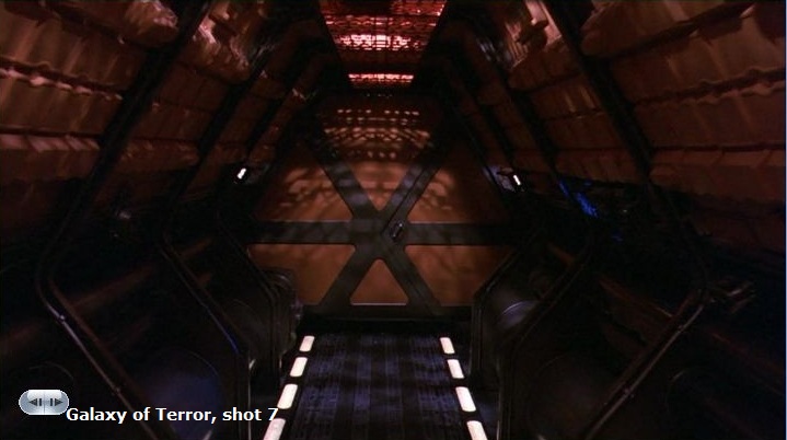
We begin with this objective shot of Ranger running through a corridor:


We cut to a subjective shot of his POV rushing through the corridor:


Cut back to an objective shot of Ranger:


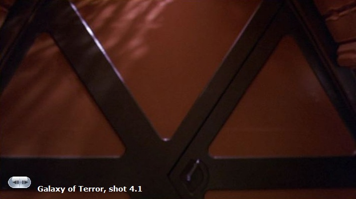
Cut back to a subjective shot of his POV, rushing toward this door:


But then the door opens -- and out comes Ranger!

We were fooled! Shot 4, unlike Shot 2, was not subjective! Not Ranger's POV.

By misleading viewers, director Bruce D. Clark has unnerved the audience, fraying its nerves for potential future shocks.


Cut to what looks like Ranger's moving POV:


And once again, the subsequent shots alternate between what appear to be subjective and objective shots.


Ranger approaches yet another door.

This appears to be his POV moving toward the door:


Will we be fooled yet again? When the door opens, will Ranger enter or exit from the doorway?


Neither!

The door opens -- and out comes the burnt body of Captain Trantor!


The previous misdirection in Shots 3/4 lowered our expectations for anything gruesome exiting from the second doorway, making Trantor's appearance all the more shocking.

===================

For more about how horror uses editing, and the difference between shocks vs. frights, see Horror Film Aesthetics: Creating the Visual Language of Fear. This blog represents a continuing discussion of my views on horror, picking up from where the book left off.

Also read my post on how editing misleads audiences in Vacancy.